OMGF v6.3.3 & OMGF Pro v5.2.0: CLS Detection & Magic Fallbacks
Two releases. One theme: less layout shift, more magic.
Fonts are one of those things that can make or break a page’s perceived performance. Get them right, and your site feels snappy and polished. Get them wrong, and visitors are treated to a lovely jumpy layout every time a page loads — which, as it turns out, Google also really doesn’t appreciate.
With OMGF v6.3.3 and OMGF Pro v5.2.0, we’re tackling that problem from two angles: automatic detection in the free version, and a smarter — dare I say, magical — solution in Pro.
Table of contents
🔍OMGF v6.3.3 — The Performance Checker Now Detects CLS
The Performance Checker — introduced in v6.2.0 — already flagged unused subsets, unused font weights, and missing preloads. In v6.3.3, it adds a fourth signal: Cumulative Layout Shift caused by fonts or, CLS.
If your fonts are causing visible layout shift, OMGF will now detect it and tell you exactly where. No more guessing in PageSpeed Insights.
The fix, of course, is Magic Fallbacks.
✨OMGF Pro v5.2.0 — Magic Fallbacks
While your Google Font is loading, the browser has to render text in something. If you haven’t told it what to use, it’ll just pick whatever it feels like — and the result is a visible layout jump when your actual font kicks in.
The solution is a fallback font stack: a system font that steps in as a placeholder. The trick is finding one that’s close enough in size and shape that the swap is barely noticeable.
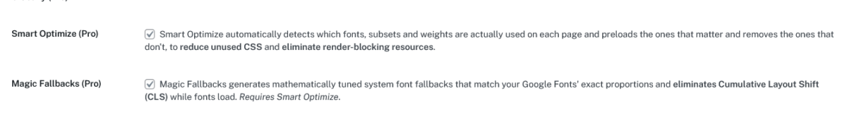
OMGF Pro already had an option for this — you could manually pick a fallback font from a dropdown for each of your Google Fonts. Useful, when I built it back in the stone age. You still had to figure out yourself which system font came closest to your Google Font, and hope for the best.
Magic Fallbacks drags that feature kicking and screaming into 2026. It automatically finds the best matching system font for each of your Google Fonts and fine-tunes it to match the original’s proportions as closely as possible — on every operating system. No dropdowns. No guesswork.
To show you what that means in practice: both GIFs below use Verdana and Tahoma as fallbacks for Poppins and Public Sans. The difference is that the first one uses them as-is — same fonts, but without any fine-tuning. Watch what happens when the Google Fonts kick in:
Notice the jump? That’s your CLS score going up.
Now here’s the same page, same fallback fonts, but this time with Magic Fallbacks doing its thing:
Same fonts. Completely different result.
🚀Conclusion
CLS detection in the free version, Magic Fallbacks in Pro. Two features, one goal: fonts that load cleanly, every time, on every page — without you having to think about it.
If you’re already using Smart Optimize, Magic Fallbacks is one checkbox away. If you’re not using OMGF Pro yet — well, now you have two more reasons to. 😄
Questions? Remarks? Know a good joke? Leave a comment!